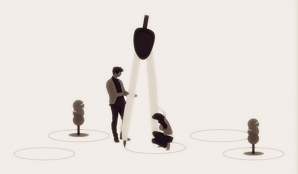
Principles of design are a set of rules to make the design process more purposeful and productive.
Design is not a new thing, and we are designing from the beginning of human life. The first humans created weapons from stones, houses by using trees, and still, we have continued the process of designing to make life a bit easier. We may not have that much information earlier, but today, we are living in an information age and that too within our fingertips.
Knowledge becomes a principle when it is validated again and again, and those principles, if kept in mind, do make the process easier. Similarly, the seven principles of design that I am sharing are so powerful and game-changers that they can literally take your design thinking at new heights. So Let’s begin.
1. The 80/20 Rule aka Pareto Principle
For many events, roughly 80% of the effects come from 20% of the causes.
As the law states, many times, your 20% actions are yielding 80% results what Mr. Pareto observed in his time that 20% of people in his country posses 80% of the wealth. And this observation is still valid in the current time. The beauty of this law is that it can be applied to anything. Let’s take an example. If I say we wear our pajamas 80% of the time compared to other clothes, This does make sense. Although the law is named the 80/20 rule, it does not literally mean to stick with those numbers. In broader terms, we can say very few inputs generates a large part of the output.
The Application
The application of this principle can result in the elimination of waste and improved productivity. Just focus on the things that matter most.

2. Affordance
Affordance is a relationship between the physical characteristics of an object and its use. As a designer, we need to make sure of the appearance of an object don’t contradict its use. The appearance of an object is such that the user gets the idea of how to use it or the purpose of it without any manual. For example, buttons are made to push, and we know it when we see one—a design with better affordance results in better usability and positive customer feedback.
If you are UI/UX designer, the affordance plays a significant role in your designs. A user should get the information and use your map with ease; otherwise, they won’t stay.
3. KISS ( Keep It Simple Stupid )
The acronym KISS (Keep It Simple Stupid) is coined by Kelly Jonson, the lead engineer at the Lockheed Skunk Works. KISS asserts that simple systems work better compared to complex systems. Simplicity should be vital to the design, and complexity should be avoided. A simple design is easier to make and easier to use. Simple designs work better and cheaper to be made. So Just, Keep It simple stupid.
4. Desire Line
Desire lines represent the traces of wear and use, which may indicate the preferred way of interaction. A desire line is not a new concept, and as per Wikipedia, which lists it as a Desire Path, it is the shortest route from origin to destination. The desire lines are used mostly for landscape designing, but they can also be applied to any design concepts. For example, by paying attention to desire lines, we can monitor user behavior and his unbiased preference, which can open up new ways of improvement.
5. Flexibility Trade-Offs
An increase in flexibility results in poor usability and performance, Accommodating flexibility means designing a system or tool to cater to a broader set of tasks, but this makes the design complex, which results in decreased usability. For example, The Swiss Army Knife has many tools to perform different tasks, but when you have a standalone equivalent tool available, you will not use it. A system can either support multiple tasks inefficiently or help in one task efficiently; there is no other way around.
6. Chunking
Chunking is an art of grouping units of information to make it easier to process and remember. The term chunk means a unit of information in the short term memory. For example, it is difficult to remember a ten-digit number, but breaking it to small parts of 2-3 chunks helps us to recall it; this is how you remember someones phone number. While designing a digital product, it is crucial to group the information so that a user can digest it easily.
7. Mapping


An agreement between layout and movement between controls and the things they control is called mapping. Just see the images above, in the first image, it is hard to know which switch controls which fan. In the second image, the arrangement of switches is matching the arrangement of fans. Proper mapping increases usability and poor mapping results in the opposite. For example, pushing a switch up to move window lasses up is an appropriate mapping, and the opposite of it will create poor mapping and poor usability.
Over To You
I hope I did justice to the blog topic. Do comment and share.
At Cre8r our design approach is to make a system more usable and efficient, and that is only possible if you have in-depth knowledge of principles of design.


