
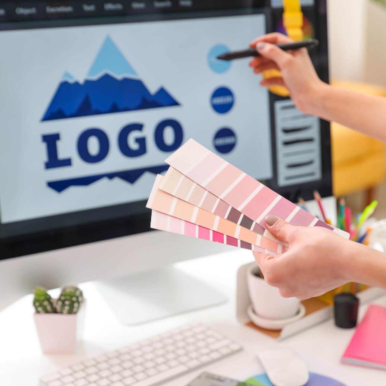

Have you ever looked at a design and felt something was off, but couldn't pinpoint why? That's often a sign that core design principles were overlooked. Whether you're a beginner or a seasoned pro, revisiting these fundamentals can transform your work from messy to masterful. Let's dive into the 10 timeless graphic design principles that separate amateur designs from professional ones.
1. Balance: The Art of Visual Stability
Balance isn't just about symmetry; it's about distributing visual weight so that no single part of the design feels heavier than another. Think of it like a seesaw: you can have a large element on one side balanced by several smaller ones on the other.
There are three main types of balance:
- Symmetrical balance: Elements are mirrored on either side of a central axis. It feels formal and orderly.
- Asymmetrical balance: Different elements (like a large photo vs. a block of text) are arranged to create equilibrium. It feels dynamic and modern.
- Radial balance: Elements radiate from a central point, like a mandala. Great for logos or posters.
For example, a minimalist poster might use asymmetrical balance with a bold headline on the left and a small graphic on the right, creating tension that draws the eye.
2. Contrast: Creating Visual Interest
Contrast is the secret sauce that makes elements stand out. You can create contrast through color, size, shape, texture, or typography. Without contrast, your design looks flat and boring.
"Contrast is the most powerful tool for creating hierarchy and guiding the viewer's eye." – Unknown Designer
For instance, pairing a thick sans-serif headline with a light serif body text creates immediate visual interest. Or using a bright accent color against a dark background draws attention to a call-to-action button.
3. Hierarchy: Guiding the Viewer's Eye
Hierarchy arranges elements in order of importance. The viewer should know where to look first, second, and third. This is achieved through size, color, spacing, and placement.
A typical hierarchy in a website hero section might be:
- Headline (largest, boldest)
- Subheadline (smaller, lighter)
- Call-to-action button (contrasting color, prominent)
Without hierarchy, the user gets overwhelmed. For example, a busy flyer with all text the same size forces the reader to work hard to find key info.
4. Repetition: Building Consistency
Repetition ties a design together by reusing the same elements—like colors, fonts, or shapes—throughout. This creates a cohesive look and reinforces branding.
Think of a brand's social media posts: they all use the same color palette, font, and logo placement. This repetition builds recognition. In a single piece, repeating a graphic element (like a circle motif) can unify different sections.
5. Alignment: Creating Order
Alignment ensures every element has a visual connection to another. Nothing should be placed arbitrarily. Proper alignment creates a clean, organized appearance.
Common alignment techniques include:
- Grid systems: Dividing the page into columns and rows to align elements.
- Baseline alignment: Aligning text to a common baseline.
- Edge alignment: Aligning elements to the left, right, or center.
For example, a business card with left-aligned text looks much more professional than one with text scattered randomly.
6. Proximity: Grouping Related Elements
Proximity means placing related items close together. This reduces clutter and helps the viewer understand relationships at a glance.
In a restaurant menu, prices are placed next to dish names, not in a separate column. In a resume, contact info is grouped together. When elements are too far apart, the design feels disjointed.
7. White Space: Letting It Breathe
White space (or negative space) is the empty area around elements. It's not wasted space—it gives the design room to breathe and improves readability.
Luxury brands use lots of white space to convey elegance. A cluttered layout, on the other hand, feels cheap and overwhelming. Even a small amount of white space can make a design feel more sophisticated.
8. Scale and Proportion: Playing with Size
Scale creates emphasis and hierarchy. A large element grabs attention first, while smaller ones recede. Proportion refers to the relationship between sizes.
For instance, a movie poster might feature the protagonist's face huge, with the title smaller below. Or a website might use a giant hero image with tiny navigation links. The key is to use scale deliberately, not randomly.
9. Typography: More Than Just Pretty Letters
Typography is the art of arranging type. Good typography improves readability and sets the tone. Key principles include:
- Limit fonts: Use no more than 2-3 fonts.
- Establish hierarchy: Different sizes and weights for headings vs. body.
- Line length: Keep lines 50-75 characters for comfortable reading.
- Leading and kerning: Adjust line height and letter spacing for clarity.
A classic example is pairing a bold sans-serif for headlines (like Helvetica) with a serif for body text (like Garamond).
10. Color Theory: Choosing the Right Palette
Color evokes emotion and attracts attention. Understanding color theory helps you create harmonious palettes. Basic schemes include:
- Complementary: Colors opposite on the wheel (e.g., blue and orange) for high contrast.
- Analogous: Adjacent colors (e.g., blue, teal, green) for harmony.
- Monochromatic: One hue with varying shades for elegance.
For example, a health brand might use green and blue for a calming, trustworthy feel, while a fast-food chain uses red and yellow to stimulate appetite and urgency.
Frequently Asked Questions
What is the most important design principle?
While all principles matter, hierarchy is often considered the most critical because it directly affects how users process information. Without hierarchy, even a beautiful design can fail to communicate effectively.
Can I break design principles?
Yes, but only after you understand them. Breaking rules intentionally (e.g., using asymmetry for impact) can create striking designs. But breaking them by accident usually leads to chaos.
How do I practice these principles?
Start by analyzing designs you admire: identify which principles are at play. Then, create simple projects (like a poster or business card) focusing on one principle at a time. Tools like Canva or Figma make it easy to experiment.
Final Thoughts
Mastering these 10 graphic design principles won't happen overnight, but consistent practice will make them second nature. Remember, great design isn't about following rules blindly—it's about using them as tools to communicate clearly and beautifully. Start with one principle today, apply it to a project, and watch your designs transform.


Comments (0)
No comments yet. Be the first to comment!