01 Motion Graphics
Applying motion to illustrations makes our designs stand out and bring them to life — adding extra details and personality.
Motion makes a design come alive. Earlier, motion design was included for aesthetics, but now it is a vital feature in turning users’ interactions seamless and predictable. Motions do storytelling. Every tapped button and screen transition has a story at hand.
Companies want to give better narratives via product experiences and make motion design an integral part of modern user-interface design. With the advanced computing potential of devices, motion in software ensures the effortless functioning of complex animations. Using motion design just for the heck takes away its charm.

Motion design carves the way for usable user interfaces. Animation plays a crucial role in refining the user experience and adds an interactive quotient for visual storytelling.
It shows relationships between a product’s different UI features, thus ensuring smoother navigation. Designers can pick animated icons, logos, and illustrations to engage the users.
Best UI Motion tools
- ADOBE After Effects +Lottie
- Flow
- Kite Compositor
- Sketch + Timeline Plugin
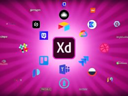
- Free Adobe XD
02 3D Elements
3D graphics exist pretty much everywhere — in movies, video games, and adverts on the streets. 3D graphics were introduced a few decades ago and since then has improved and evolved dramatically. Mobile and web technology is also multiplying fast. New web browser capabilities have opened the door for 3D graphics, allowing us to create and implement amazing 3D graphics into modern web and mobile interfaces.
Creating and then integrating 3D graphics into web and mobile interfaces requires some specific skills and tons of work, but very often, the results are advantageous.

3D graphic renders present the product or services in a much more interactive and engaging way: for instance, 3D graphics could be viewed in 360-degree presentation, improving the overall UX of the product.
In 2021, even more brands will use 3D render models to present the product or services to emulate the real world (in-store) shopping experience.
03 Animated Illustrations
Illustrations have the unique potential to add emotion, clarity, and beauty to your user interface. They enrich the user experience your site delivers by:
- Getting the main point across faster than text.
- Engaging the user through their journey.
- Creating dynamic brand experiences.
- Strengthening the aesthetic appeal of the user interface.

Illustrations can be drawings, sketches, graphic designs, or printed works of art. They are used to clarify, decorate, or visually represent text or complex ideas.
UI designers use illustrations in their designs to serve many purposes, the most important of which is to deliver a good user experience. In this blog, we’ll take a look at some of the ways using illustrations in UI improves user experience.
4 Ways UI Illustrations Improve UX
- GET THE MAIN POINT ACROSS FASTER THAN TEXT
- ENGAGE THE USER THROUGH THEIR JOURNEY
- CREATE DYNAMIC BRAND EXPERIENCES
- STRENGTHEN THE AESTHETIC APPEAL OF THE UI
04 Light & Dark modes
UI is much more than a coat of paint or a Tinder profile. It is an entire environment, a multi-faceted construct where every single pixel counts. Colour theory, layout, typography, font selection – these small elements we rarely consider for more than a few seconds when using a platform painstakingly chooses to optimize the entire experience.
When clients ask us a question like ‘what’s better, a light-based user interface or a darker one?‘, the answer is not so simple. Countless factors should influence a design decision as crucial as the foundation of your platform’s UI.

Whether it is a light UI or a dark one, your choice will impact one pillar of usability more than any other: readability. That is because readability is so dependent on contrast – precisely the juxtaposition between text and background. You obviously would not want to pair similar font and backdrop colors together, but even diametric opposites such as black-on-white or white-on-black have their pros and cons.
For most cases, black text on a light UI remains the most readable. It is why nearly all blogs, newspapers, and other online publications (like UsabilityGeek, for instance), employ a white or off-white background with simple, black text.
05 Typography
Typography involves the arranging and selection of types to make written language legible. It is an art form that has been around for centuries, ever since man invented writing. Although typography brings complicated decisions for many UI designers, the time we could dedicate to this motif will be valuable to make a design more outstanding.
There are six typographic fundamentals to produce a more usable and engaging experience.
Color
The color of the typeface should have a correct contrast with the background. Each character, word, or paragraph must be read immediately and without effort, using the color of the font versus the background color.
Complexity
The complexity of the typeface will depend on its size on the screen. More intricate and artistic typefaces need to be larger due to their details. On the other hand, synthesized or straightforward typefaces can afford to be smaller.
Space
Negative space around letters can improve readability. Distancing two elements makes their shapes easier to understand and helps to create visual associations or dissociations. Mastering the art of spacing is a critical factor for visual comfort.

Size
Establishing size hierarchies gives clarity to the content. The larger the size, the more recognizable it will be from the rest. Text hierarchy is used in design because it allows the reader to understand, at a glance, the importance of the information.
Uppercasing
Uppercase text can lead the sight to specific areas in the design. This option can regain the user’s attention when the lower case has already been overused.
Alignment
Text alignments define the structure and bring unity. Although it is not very detectable by the user and is difficult for designers to theorize, text alignments help connect elements efficiently.


