

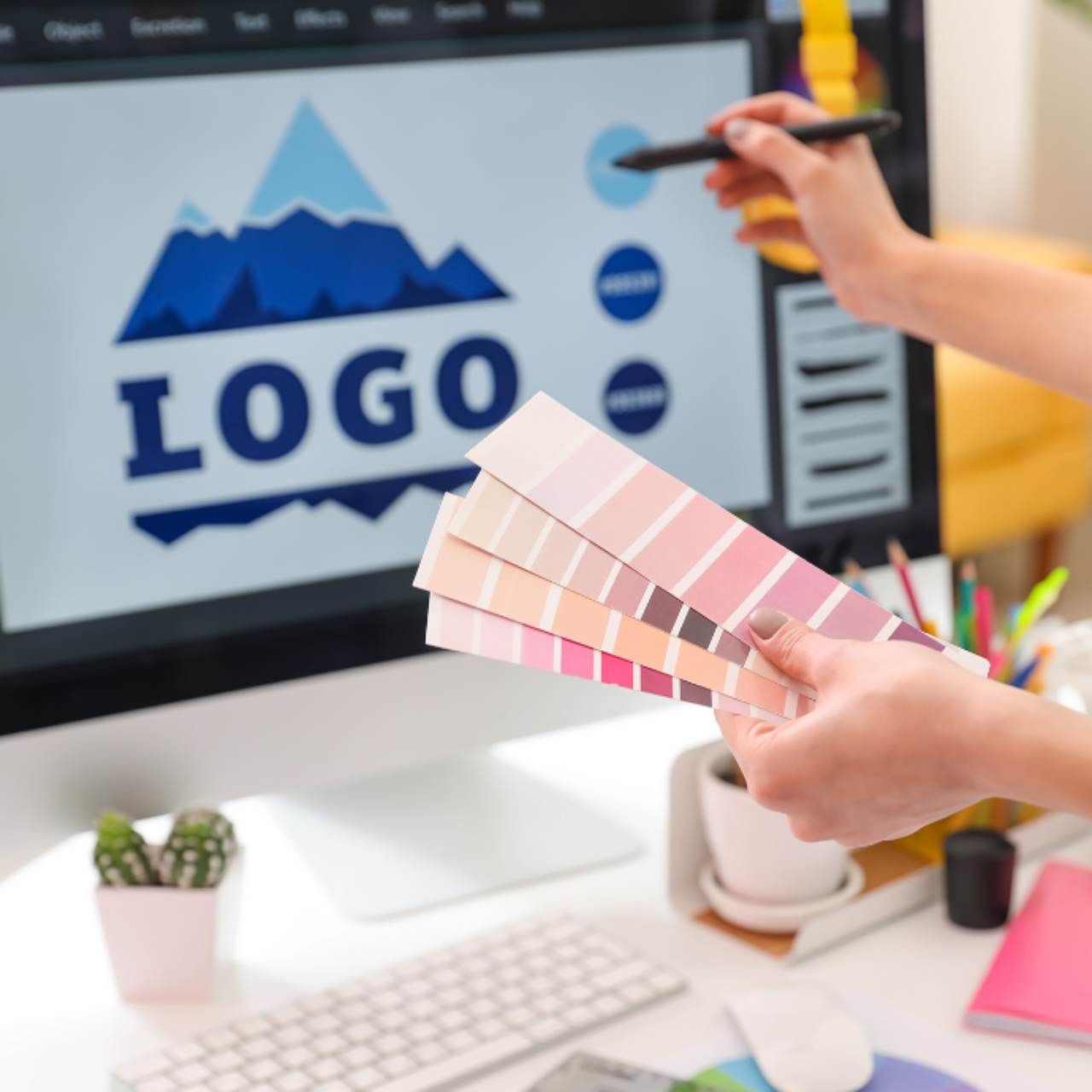
You have three seconds to make an impression. In that blink of an eye, your logo needs to communicate who you are, what you stand for, and why anyone should care. But most logos fail. They chase trends, overload with detail, or look dated within a year. The logos that endure—think Nike, Apple, or Coca-Cola—share specific traits. Here are the 10 principles that separate forgettable logos from iconic ones.
1. Simplicity Is Your Superpower
A simple logo is easier to recognize, remember, and reproduce. It works at the size of a favicon or a billboard. The Nike swoosh has no text, no color gradient—just one fluid curve. That curve cost $35 in 1971 but is now worth billions.
Ask yourself: if you stripped away every detail, would the core shape still be recognizable? If not, keep simplifying. Remove shadows, gradients, and extra lines. Test your logo at 16x16 pixels. If it blurs into a blob, go back to the drawing board.
"Simplicity is the ultimate sophistication." — Leonardo da Vinci
2. Make It Memorable
Memorable logos often use a single, distinctive element. The bitten apple, the three stripes, the interlocking rings. These shapes are so unique that they become shorthand for the brand.
To achieve memorability, avoid clichés. A globe for a travel company? A lightbulb for an idea? Those are forgettable. Instead, find a metaphor that is specific to your brand story. For example, the Amazon logo's arrow points from A to Z, subtly conveying that they sell everything. It's clever and sticks.
- Test for recall: Show your logo to a friend for 5 seconds, then ask them to draw it from memory. If they can't, it's not memorable.
- Unique silhouette: Can you identify the brand from just the outline? The golden arches of McDonald's work because of their distinctive shape.
3. Timeless Over Trendy
Trends come and go. The 3D glossy logos of the early 2000s look painfully dated now. A timeless logo avoids fads and focuses on enduring design principles. The Coca-Cola script has barely changed since 1887. It's not "modern," but it's still fresh.
To test timelessness, design in black and white first. If your logo relies on a trendy color palette or gradient, it will age. Add color later, but ensure the shape works without it. Also, avoid overusing current typefaces. Custom lettering often outlasts fonts that scream a specific decade.
4. Versatility Across Mediums
Your logo will appear on a website, a business card, a billboard, a mobile app icon, and maybe even a tattoo. It must work everywhere. This means scalable vector files, legible at any size, and functional in both color and monochrome.
Create a responsive logo system: a full version with text, a compact icon-only version, and a stacked version for narrow spaces. For instance, the Starbucks logo loses the text ring on smaller applications but remains instantly recognizable.
5. Appropriate for Your Audience
A law firm's logo should feel trustworthy and professional. A children's toy brand can be playful and colorful. The style, color, and typography must align with your brand's personality and audience expectations.
Research your competitors. If every tech startup uses a minimalist sans-serif logo, standing out might mean using a serif or a hand-drawn element. But don't be different for the sake of it. The logo must resonate with the people you want to attract.
- Define your brand's core traits: serious or fun? Traditional or innovative?
- Choose colors based on psychology: blue for trust, red for energy, green for nature.
- Pick typography that matches: serif for authority, sans-serif for modernity, script for elegance.
6. Strong Composition and Balance
A well-balanced logo feels stable and professional. Use the golden ratio or grid systems to align elements. The eye should flow naturally across the design without confusion. Symmetry is safe, but asymmetry can be dynamic if handled well.
Check for optical balance. Not everything needs to be mathematically centered. The FedEx logo uses a hidden arrow in the negative space between E and x—a masterclass in composition. Study the negative space: it can add hidden meaning and improve balance.
7. Scalable Vector Format
Always design in vector software like Adobe Illustrator or Affinity Designer. Raster images (like JPEGs) become pixelated when enlarged. Vectors are resolution-independent, ensuring your logo looks sharp on a business card or a highway billboard.
Provide clients with multiple file formats: SVG for web, EPS for print, PNG for social media. And always include a black-and-white version. Many printers require it, and it ensures your logo works without color.
8. Color Strategy That Works in Black and White
If your logo relies solely on color to be recognizable, it's a weak design. The shape should be distinct enough to work in black and white. Think of the Puma logo—the leaping cat is clear without color. Color should enhance the design, not define it.
When choosing colors, consider accessibility. Avoid low-contrast combinations like yellow on white. Use tools like Color Safe to ensure readability. Also, limit your palette to 2–3 colors maximum. More than that clutters the design and increases printing costs.
9. Tell a Story
The best logos have a story behind them. The arrow in the Amazon logo, the Baskin-Robbins 31 hidden in the letters, the Toblerone bear in the mountain. These hidden meanings create a sense of discovery and deepen brand connection.
Your story doesn't have to be hidden. It can be explicit, like the FedEx arrow. But it should be intentional. Think about your brand's mission, history, or unique selling point. How can you visualize that in a simple mark?
10. Get Feedback, But Trust Yourself
Show your logo to a diverse group of people—not just designers. Ask them to describe what they see without prompting. If they mention elements you didn't intend, you may have a problem. But at the end of the day, you are the expert. If a client insists on a change that weakens the design, explain your reasoning. Sometimes you need to say no.
Treat your logo as a living asset. As your brand evolves, the logo may need minor updates. But if you follow these principles, those updates will be subtle refinements, not complete overhauls.
Frequently Asked Questions
How much should a professional logo design cost?
Prices vary widely: from $5 on freelance marketplaces to $5,000+ for a branding agency. A decent local designer might charge $500–$1,500 for a logo package. Remember, you get what you pay for. A cheap logo may infringe on trademarks or be a template. Invest in a design that you can legally own and that represents your brand well.
What file formats do I need for my logo?
At minimum, you need an SVG (scalable vector) for web, an EPS or AI for print, and a high-resolution PNG with a transparent background for social media. Also request a black-and-white version. Avoid using JPEG for logos because it lacks transparency and compresses poorly.
How often should I redesign my logo?
There's no set rule, but most brands undergo a major redesign every 10–15 years. However, if your logo looks dated after 5 years, you probably followed trends instead of timeless principles. Minor refreshes (color tweaks, font updates) can happen more frequently, but the core shape should remain consistent for brand recognition.
Final Thoughts
Designing a logo that lasts is not about following the latest design trends or cramming every meaning into one mark. It's about discipline: choosing simplicity over complexity, timelessness over novelty, and meaning over decoration. The best logos feel inevitable—like they've always existed. That's the power of thoughtful design. Start with these 10 principles, and you'll create a logo that works not just for today, but for decades to come.


Comments (0)
No comments yet. Be the first to comment!