

Once, in a small pottery workshop in the hills of Japan, an old master taught his students a lesson they never forgot. He gave each of them a lump of clay and said, "Make a bowl." For weeks, they shaped, smoothed, and perfected their creations. The results were beautiful, symmetrical, and polished. Then, one day, the master took a finished bowl, held it above his head, and smashed it on the ground. The students gasped. He picked up a shard, turned it over, and traced the rough edge with his finger. "This is where the design begins," he said. "Not in what you add, but in what you break away."
That story stayed with me for years, long after I left the workshop and entered the world of digital design. In the tech industry, we're obsessed with adding: more features, more buttons, more animations, more data. But the most memorable products I've ever used—the ones that feel almost inevitable—are the ones that know what to leave out. The ones that have the courage to say no.
This isn't just about minimalism as an aesthetic. It's about a philosophy of subtraction. It's about stripping away the noise until only the signal remains. And it's a lesson that applies to everything: from a mobile app to a city park, from a corporate logo to a personal workspace. When we embrace subtraction, we don't just make things simpler—we make them better.
The Paradox of Choice in Design
I remember my first encounter with a truly subtractive product: a simple text editor called WriteRoom. It was nothing but a blank screen, green text on black, with no toolbar, no menu, no file tree. Just you and your words. I was skeptical at first. How could a tool that stripped away every feature I thought I needed be useful? But within minutes, I was writing faster and more clearly than I had in months. The absence of distractions forced me to focus. That's when I understood the paradox: too many choices paralyze us, not liberate us.
Psychologist Barry Schwartz called this the "paradox of choice." When we're faced with 40 types of jam, we buy none. When we're faced with 4, we pick one and feel good about it. Designers, though, often fall in love with the jam. We think that every added option is a gift to the user. In reality, it's a burden. Every extra button is a question: "Do I need this?" Every extra feature is a test: "Will I use this?" And every extra element on a page is a small tax on the user's attention.
The best design, then, is a process of ruthless curation. It's asking, "What is the essence of this experience?" and then cutting everything that doesn't serve that essence. It's about making conscious choices, not just adding options. When you subtract, you make room for what matters.
Subtraction as a Tool for Clarity
Let me give you a concrete example. A few years ago, I was redesigning a dashboard for a financial app. The original version was a wall of numbers: charts, graphs, stock tickers, news feeds. Users complained they felt overwhelmed and couldn't find the information they needed. My team's first instinct was to add more: better filters, more customization, a tutorial. But we were wrong. Instead, we took a step back and asked: What is the one thing a user wants to know when they open this app? The answer was simple: "How much money do I have, and is it more or less than yesterday?"
So we stripped the dashboard down to three numbers: current balance, change from last week, and a single graph of spending over time. We removed the news feed, the stock ticker, the unnecessary charts. We even removed the color scheme, replacing it with black and white, with a single green or red arrow for the trend. The result? User engagement doubled, and support tickets dropped by 40%. People didn't miss the features; they were relieved to see them go.
This is the power of subtraction: it brings clarity. When you remove the non-essential, the essential becomes vivid. It's like cleaning a foggy window—suddenly, you can see the landscape outside. In design, clarity is not about making things simple for the sake of simplicity. It's about making things simple so that they can be understood, used, and loved.
"Perfection is achieved, not when there is nothing more to add, but when there is nothing left to take away." — Antoine de Saint-Exupéry
The Beauty of Restraint
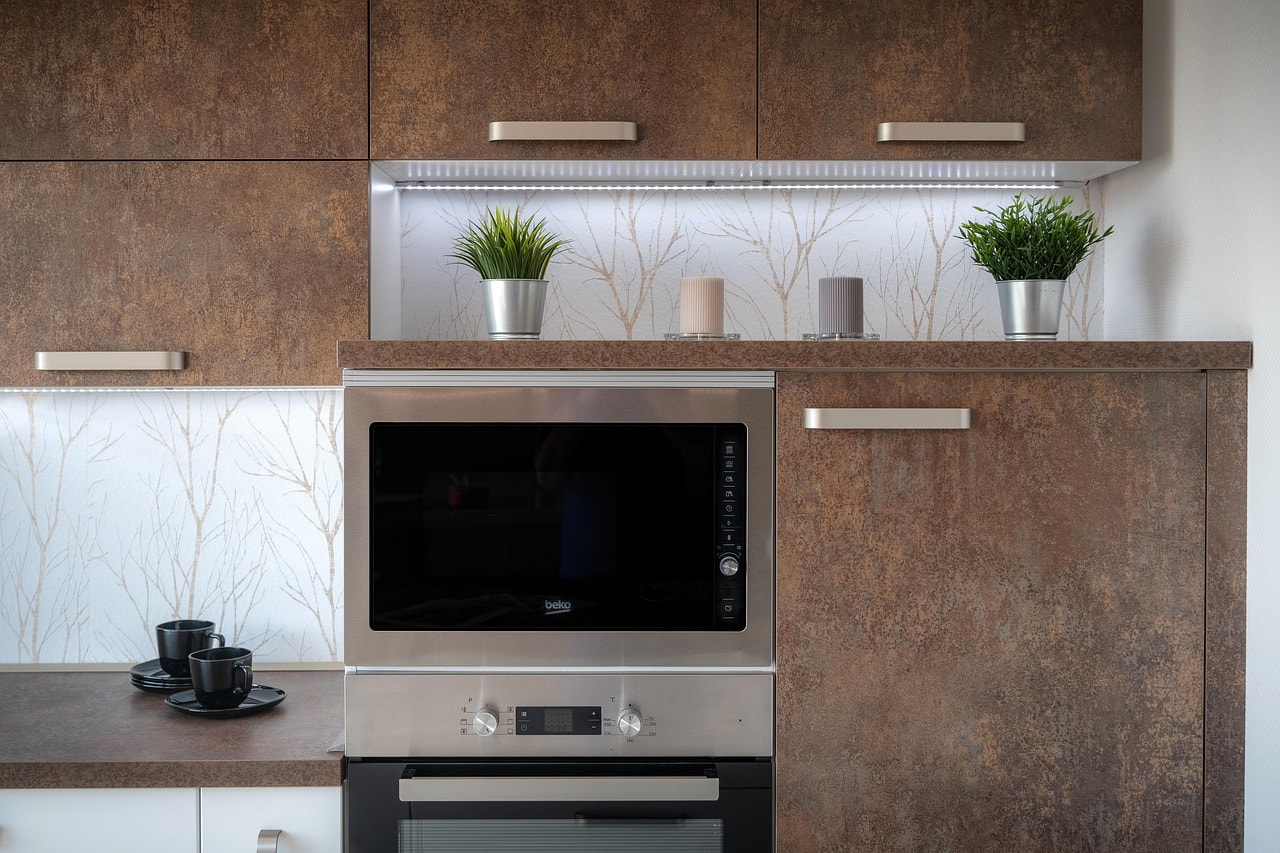
Subtraction also creates beauty. Think of a Japanese rock garden: a few stones raked into perfect patterns, with vast expanses of empty space. The emptiness isn't a void; it's a canvas for the mind. It invites contemplation. The same principle applies to visual design. When you use negative space, you give the eye a place to rest. You create a rhythm between what is present and what is absent. This is why the best logos—the Nike swoosh, the Apple apple—are so memorable. They have nothing extra. Every line is necessary.
I experienced this firsthand when I redesigned my own portfolio website. The first version was a bloated showcase of every project I'd ever touched, with parallax scrolling, hover effects, and a rainbow of fonts. It looked impressive, but no one could tell me what I actually did. So I cut it down to three projects, each with a single image and a one-sentence description. I removed the animations and the custom fonts. The site felt stark, almost too bare. But within a week, I had two job offers. The clarity of my message was more powerful than any visual trick.
Restraint isn't about being boring. It's about being intentional. It's about choosing what to say and how to say it, without the fear of missing out. In a world that constantly screams for attention, the quiet voice is the one that gets heard.
Subtraction as a Way of Life
This principle extends far beyond the digital realm. It's about how we design our days, our homes, and our relationships. I've started applying subtraction to my own life. I cleared my desk of everything except my laptop and a notebook. I unsubscribed from newsletters I never read. I stopped attending meetings that didn't have an agenda. And I found that with fewer commitments, I had more energy for the ones that mattered. The same goes for collaboration: when a team agrees on what to leave out, they can focus on what to build.
In product design, we often talk about the "minimum viable product" (MVP). But I think we should go further: the "minimum delightful product." What is the smallest thing that can bring joy and value? Often, it's not the feature-heavy behemoth we imagine. It's a single, well-executed idea. Take a note-taking app like Bear. It doesn't have a thousand plugins or a complicated folder system. It just has beautiful typography and seamless sync. That's it. And yet, it has a cult following because it respects the user's attention.
Subtraction is not the absence of effort; it's the highest form of effort. It's harder to write a short email than a long one, harder to design a simple interface than a cluttered one, harder to create a focused life than a scattered one. But the reward is a feeling of weightlessness, a sense of ease that radiates from the work.
So the next time you're faced with a design problem—or any problem—don't ask, "What can I add?" Ask, "What can I remove?" You might be surprised by how much you gain by letting go.




Comments (0)
No comments yet. Be the first to comment!